What Rolling Stone’s ‘Worst Album Covers’ List Reveals About the Art of List-Making
Rolling Stone released their “50 Worst Album Covers of All Time” list about a month ago. Yes, it seems a little late to complain about a list one month after its release, but I do have two solid excuses: The list was released on my birthday, and I was essentially “off the grid” when it dropped, and due to the Democratic National Convention this week, the news is slow. So, bully for everyone, and strap in for some silly grievances!
As someone who has published their share of lists, I’ll be forthcoming and say that one of the main purposes of publishing a list is to get people talking about it. When people talk about it and share it with their friends, this leads to more discussion, which leads to clicks and website traffic, which enables people like me to collect a paycheck every two weeks.
Now, there is a slightly dark secret about lists I will share that some may take issue with. Have you ever read any list, come across an entry in that list, and thought, “Oh! That’s not right” or “That’s ranked too low/too high!”? There’s a good chance that ranking was made on purpose to elicit a reaction. I have no problem admitting that I have purposely fudged some rankings to cause a little controversy. It’s never anything egregious, but it will often present itself as being “random.” If anyone who’s written a list said they wouldn’t dare do such a thing, they’re lying, and they likely have.
I noticed this randomness three times on Rolling Stone‘s “50 Worst Album Covers of All Time,” which featured some truly garbage album artwork and was a very fun read. One ranking that immediately caught my eye was No. 37’s Revolver by The Beatles. (Let’s face it: Any criticism against The Beatles always tends to stir things up.) The main complaint about the cover, which was created by Klaus Voormann, is that its execution is sloppy. There’s more than a little truth there, but the cover of Revolver isn’t even the worst cover in the Beatles catalog. That honor would go to the original “butcher cover” artwork for 1966’s Yesterday and Today, where the Fab Four are wearing white coats and are covered in raw cuts of meat and headless, nude baby dolls.
Australian photographer Robert Whitaker is responsible for the bizarre image. As for the inspiration behind it, Whitaker explained he wanted to represent the Beatles as just regular “flesh-and-blood men.” He said in 1966, “All over the world I’d watched people worshipping like idols, like gods, four Beatles. To me, they were just stock standard normal people.”
That’s a lovely thought, but there had to be a less disturbing way of expressing it.
Then there are the other two random moments from the list: No. 41’s Metallica (“The Black Album”) by Metallica and No. 25’s Slippery When Wet by Bon Jovi. Seemingly, these two album covers were added to the list not necessarily for being bad, but for being boring. “The Black Album” was compared to Spinal Tap’s Smell the Glove, while Slippery When Wet was discussed through the lens of a band and a record label not being able to agree on any artwork.
Maybe the covers’ boringness compared to the contents of the albums themselves made the author inclined to include them. However, there were plenty of other options to choose from instead of Metallica and Slippery When Wet. Once again, their inclusion felt very random, but as previously stated, the randomness masks the true purpose of getting a reaction out of a reader. For the sake of time, here are the two bad covers I would’ve included on the list instead.
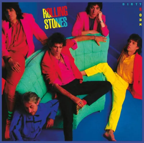
First, the cover of the Rolling Stones’ 1986 album Dirty Work should have made the cut. The fact that it was the ’80s doesn’t matter; the Rolling Stones should not be in coordinating Day-Glo outfits. If you need an explanation why that is, I’m not sure I can help you, and I can’t believe you’ve made it this far in this piece.

The second is the cover of Guns N’ Roses’ 2008 album Chinese Democracy. Truth be told, it can be argued that this cover is boring and not bad. However, when you consider Chinese Democracy was in the works for nearly 20 years and all that’s on the cover is a sepia-toned bicycle, it’s bad! What even is this?! The more I look at it, the more insulted I am.

So, what did we learn today? Lists can simultaneously be fun and annoying. Keep that in mind the next time you read one. And if something seems “random,” that’s likely by design, and it’s not so “random.”

